Background story: Dawn Bridge is a company who aims to help special needs children and its community through various platforms and services, including creating awareness, provide allergen-free product for special needs children, due to their sensitive gut and special requirements in diet to help them in terms of mood and physical health.
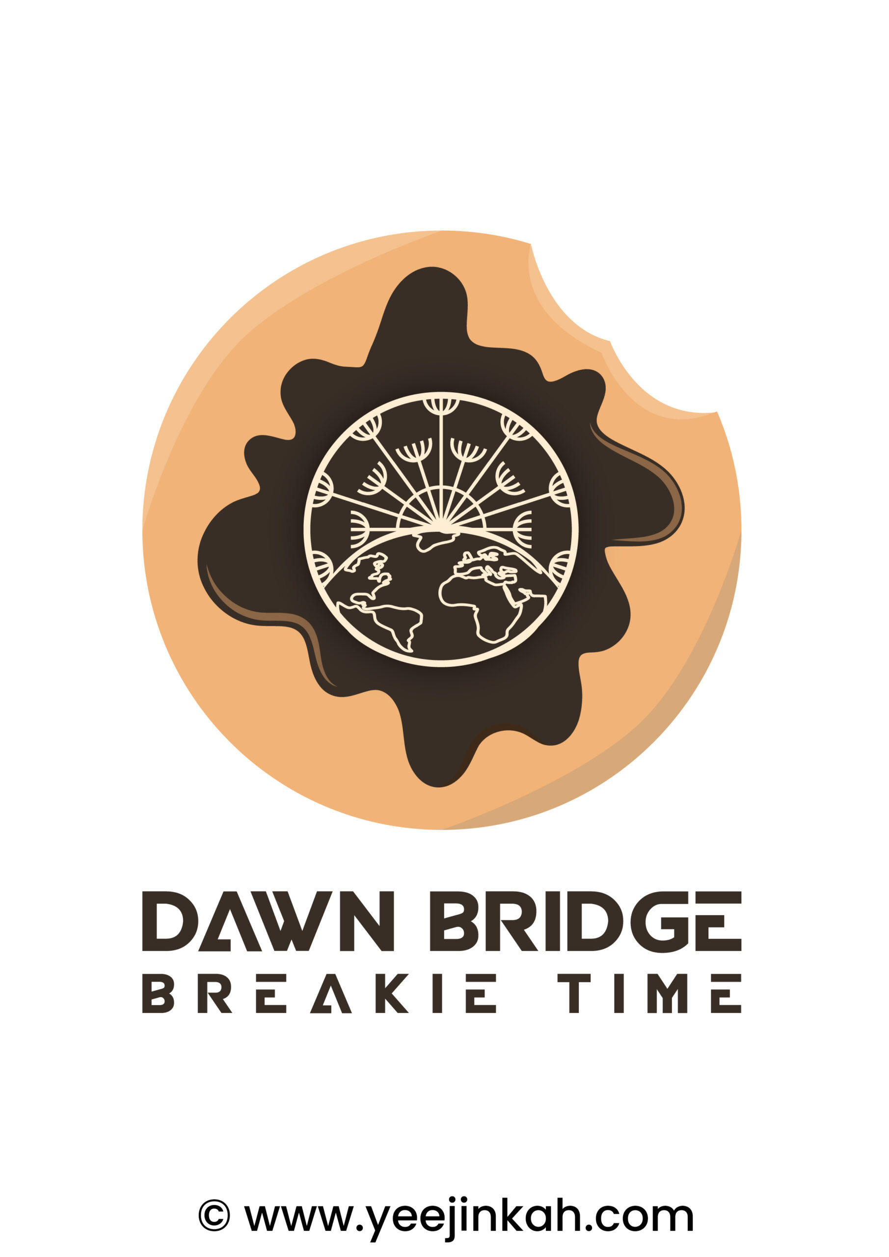
Brief: I was tasked to develop a logo for a youtube series – Breakie Time. Breakie Time is a youtube series where it is sometimes short and sweet, and sometimes involves entertaining games that catches attention while spreading awareness.
Approach: I started developing the design by understanding how this logo is going to be used, what is the nature of the youtube series, so that I know what are the visual references that I can look for to develop the logo. As Breakie Time is a fun and entertaining youtube series, I decided to go with a round doughnut, where I used the secondary logo of the brand as the centre of the logo as well. I’ve used dark bistre colour to depict the secondary logo as a piece of chocolate on top of the doughnut with splashes of melted chocolate. The little bite marks on the top right makes the logo look interesting and this detail may become an interesting feature when the logo is being developed into an animated logo. Below the Logo is the title of the youtube series and also the brand name.
Challenge & Solution: The biggest challenge of this project is to make sure the logo look fun. I think the selection of the colours and the shape of the logo managed to bring out that message.
Client: Dawn Bridge Sdn. Bhd.
Follow me on IG: https://www.instagram.com/yeejin_kah


