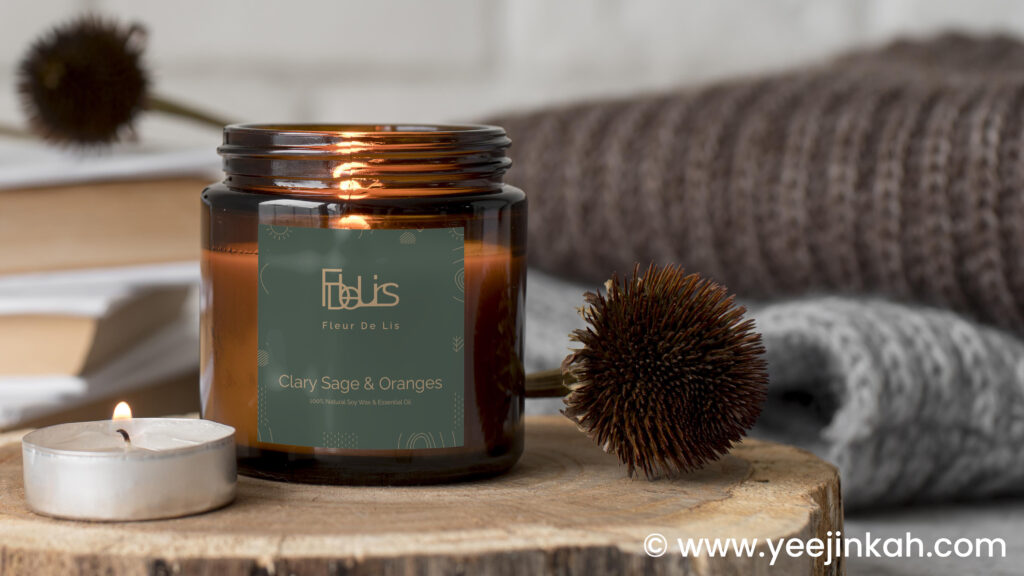
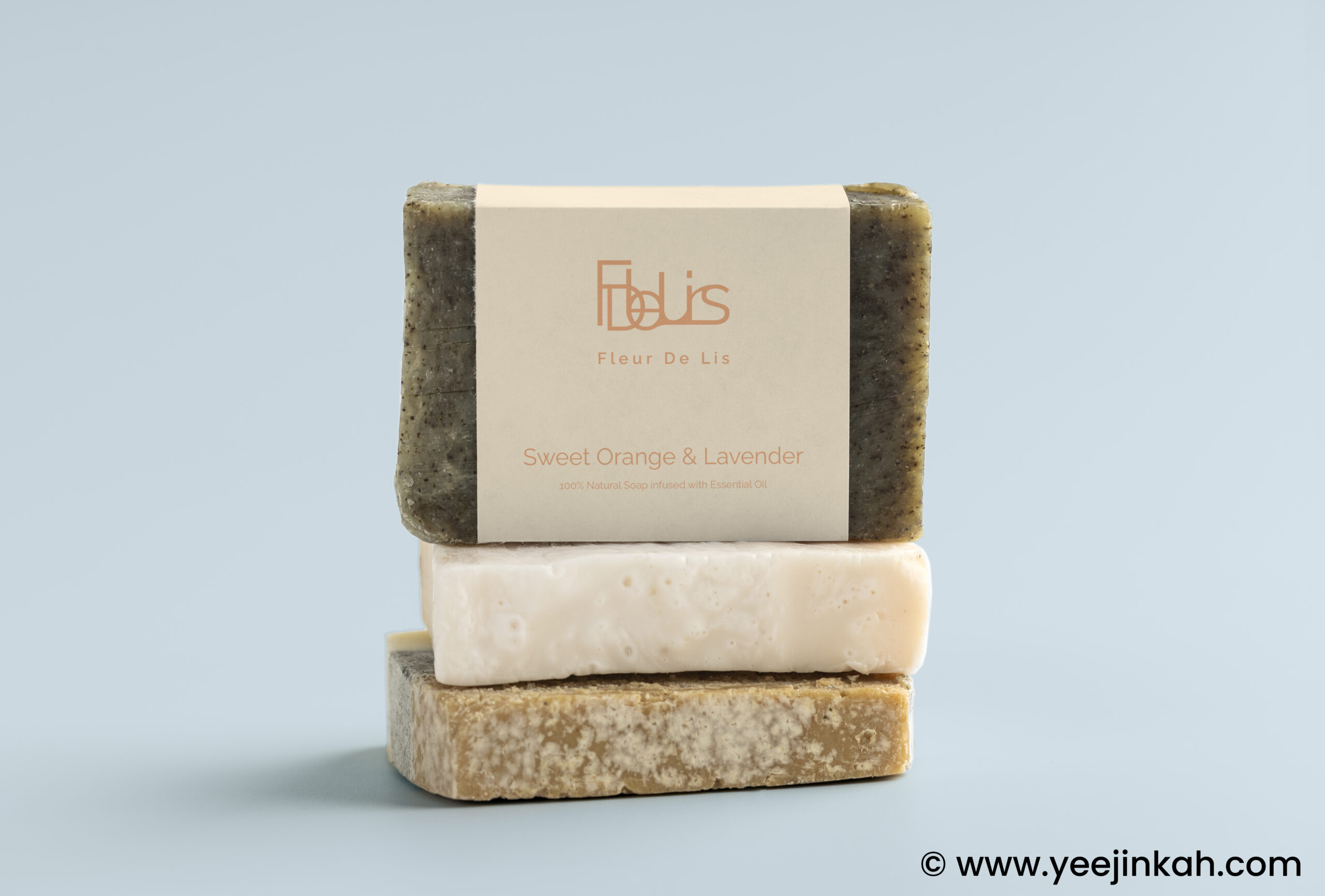
Background story: Fleur De lis is a brand selling handmade 100% pure essential oil soy wax candles. it is a start-up brand selling their handmade candles on ETSY.
Brief: I was tasked to develop a brand Identity Guideline for the Fleur De Lis.
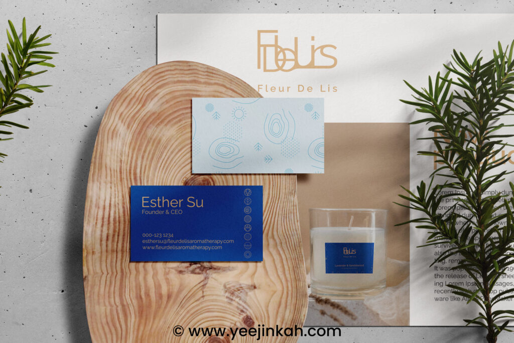
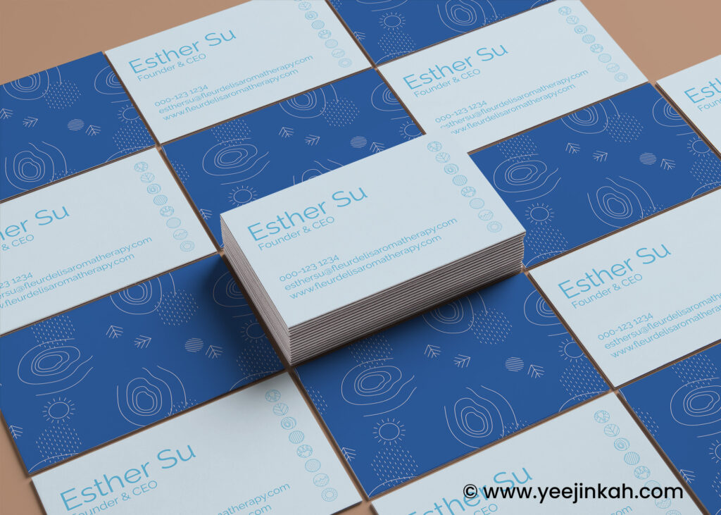
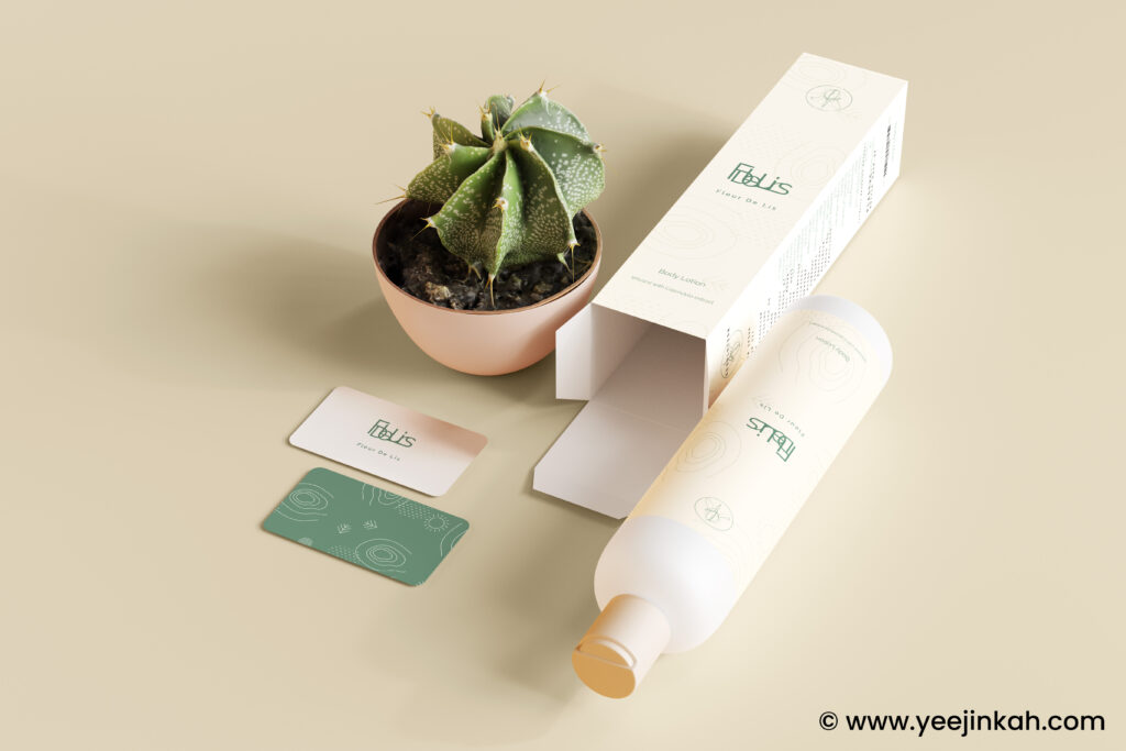
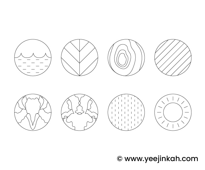
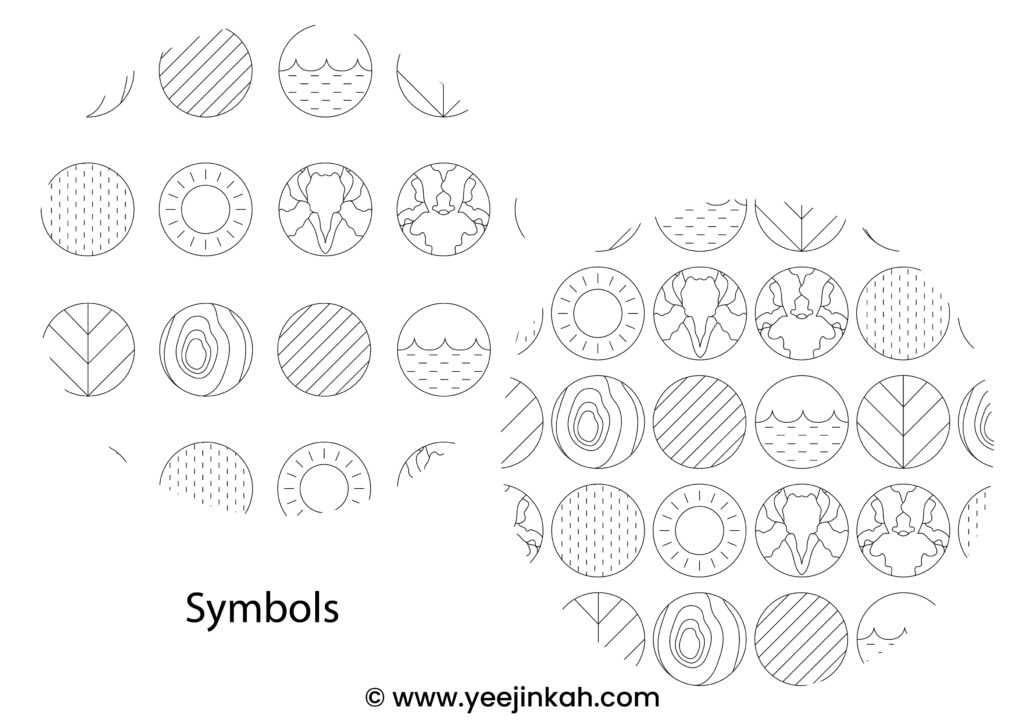
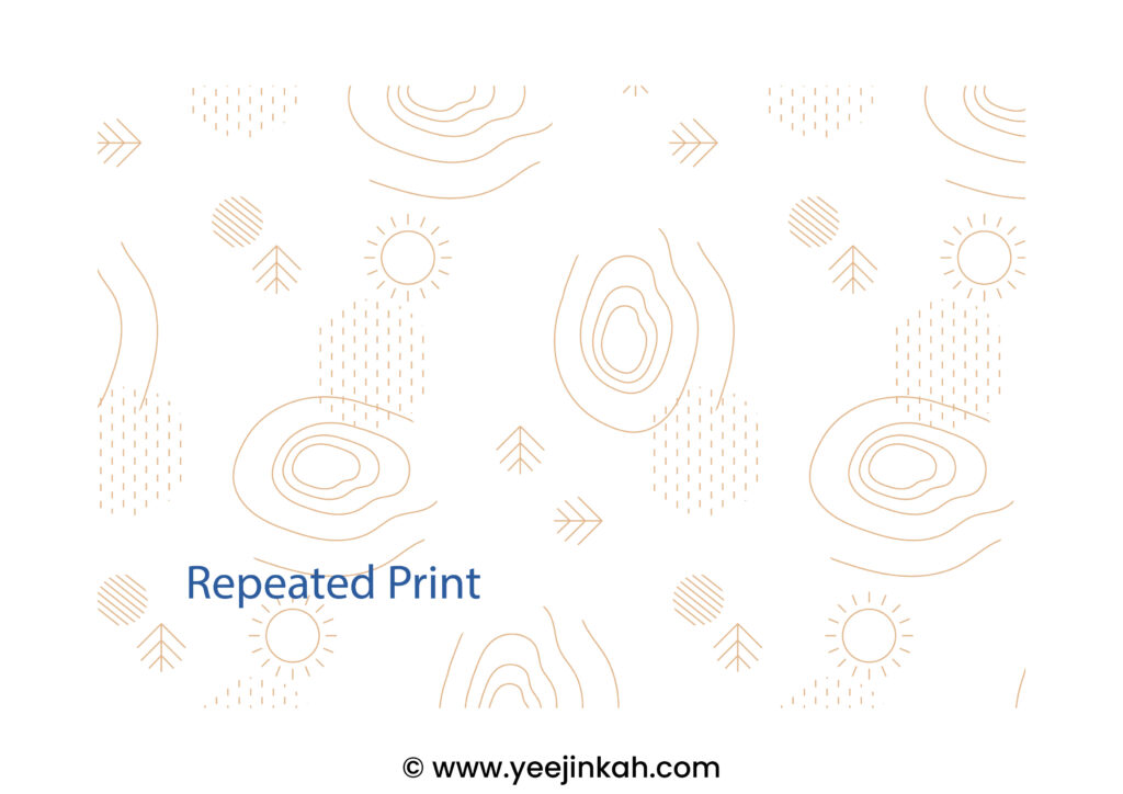
Approach: I started developing the guideline by understanding the nature of the brand, and developed a brief for the brand. Then, I started brainstorming and finding inspiration related to the brief, and selected a series of colour scheme to represent the brand. I’ve also developed a the logo based on the name of the brand, by rearranging the name of the brand and blend them together into one. I’ve also developed a series of symbols based on essential oils such as cedar-wood, pine, nature etc., to support the identity of the brand, where the symbols can be used as icons, repeated print on background and packagings.
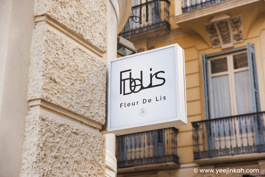
Challenge & Solution: The biggest challenge of this project is to design the logo as the name is quite long. It took sometime for me to figure out how I can develop the design by experimenting with various fonts and layouts. Even though this is a brand that sells natural products, I would like it to look premium rather than too focused on just being natural and organic, where a lot of brands does. That’s where I developed a series of symbols and also selected a series of colours that look more grounded and relax, to create colour and texture combination that looks interesting and with quality.
Client: Station Petra
Follow me on IG: https://www.instagram.com/yeejin_kah

