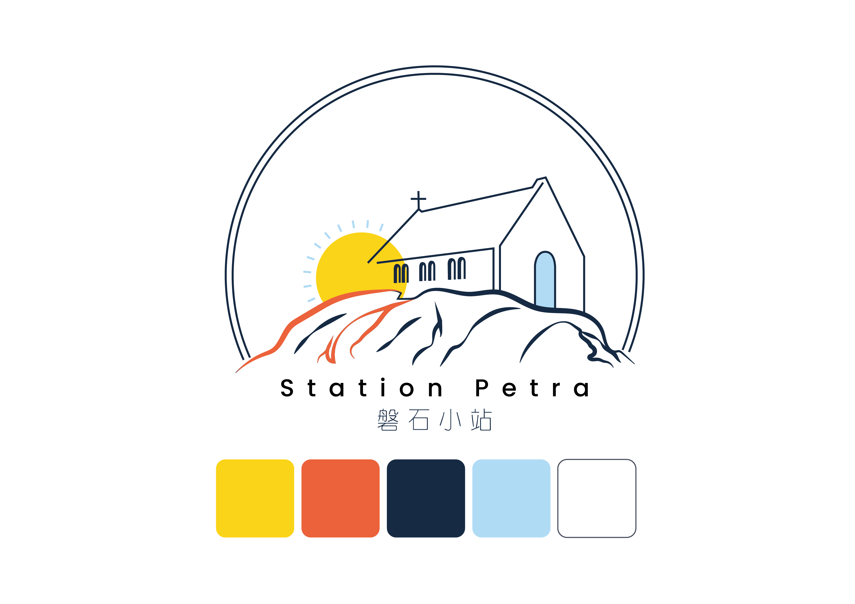
Background story: Station Petra is a local community who aims to help people in need around their local area.
Brief: I was tasked to develop a brand Identity Guideline for the Station Petra.
Approach: I started developing the guideline by understanding the nature of the brand, and developed a brief for the brand. After that, I started brainstorming and finding inspiration related to the brief, and selected a series of colour scheme to represent the brand. I’ve also developed a the logo based on the name of the brand. I’ve taken the world’s largest monolith and churches as inspiration when designing the logo, as Station Petra is a community created and lead by Christians. I am also inspired to include hopefulness to the logo by introducing sunrise and pops of colour on the logo. I also designed a series of stamp size logo using the brand’s colour scheme as part of the visual identity.
Challenge & Solution: The biggest challenge of this project is to keep the design simple yet narrative, to express that Station Petra is a place where there is hope and support. Therefore I tried to introduce cursive shapes in the logo to help introduce a gentle and flexible atmosphere, so that the brand does not look so rigid and formal.
Client: Station Petra
Follow me on IG: https://www.instagram.com/yeejin_kah


