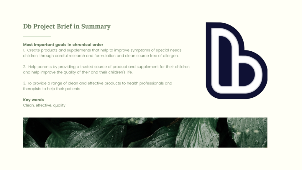
Background story: Db is a brand under Dawn Bridge, it is a supplement brand which aims to provide clean, allergen-free product for special needs children. The reason why special needs children need clean, allergen-free product is due to their sensitive gut and special requirements in diet, in order to help them in terms of mood and physical health.
Brief: I was tasked to develop a brand Identity Guideline for the brand Db.
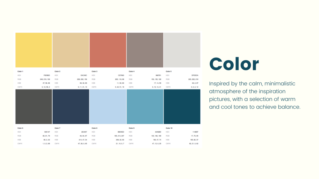
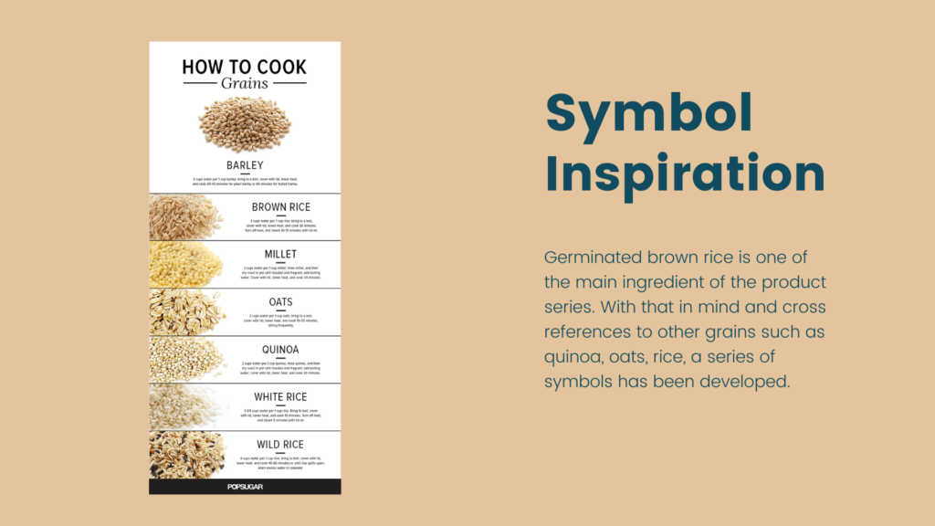
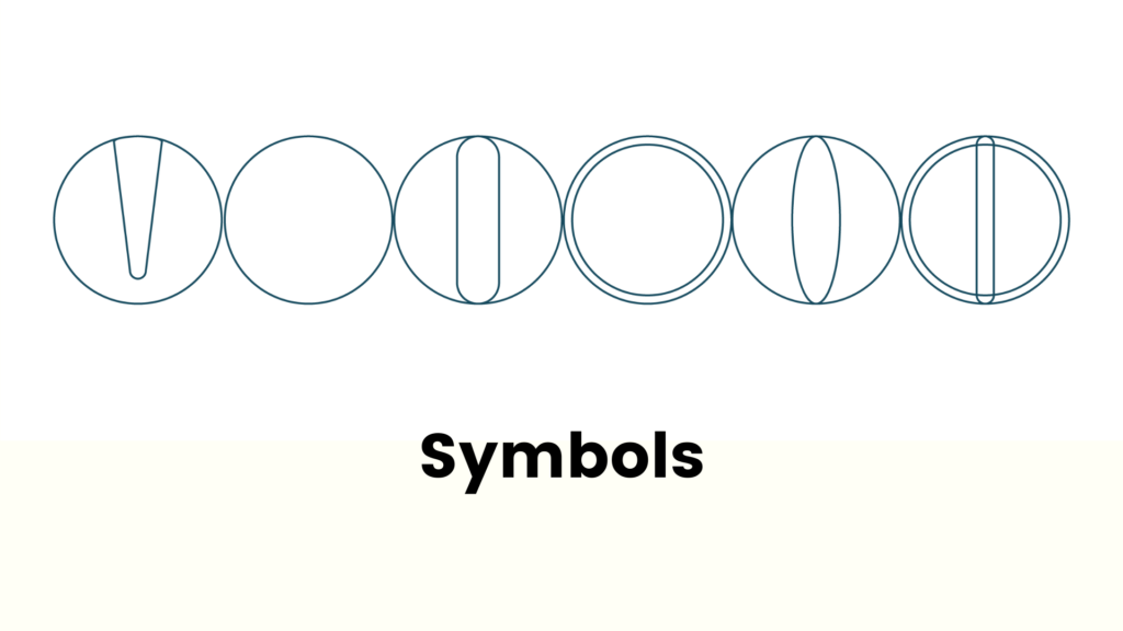
Approach: I started developing the guideline by understanding the brand and it’s direction, and developed a brief for the brand. After that, I started brainstorming and finding inspiration, and selected a series of colour scheme to represent the brand. I’ve also developed a series of simple symbols inspired by the brown rice, and cross referenced other grains for different shapes. The reason I chose this as an inspiration was because it was part of the ingredient that was used in their product.
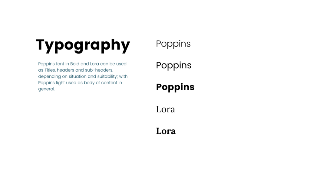
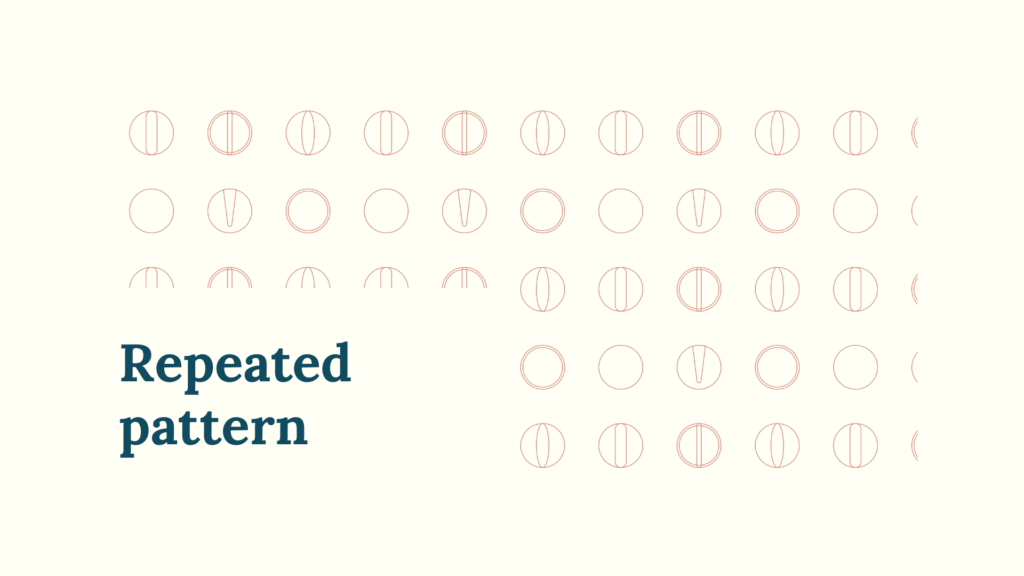
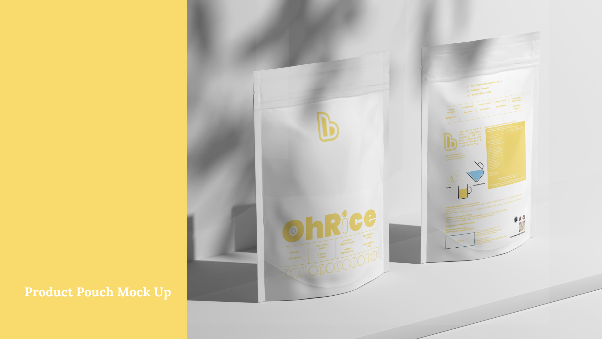
Challenge & Solution: The biggest challenge of this project is to keep the direction really simple and yet unique, eye-catching, and with strong visual identity, as the keywords for the brand are clean, effective, and quality. Thus, we can deduce that the direction of the brand’s collateral, social media, product packagings are going towards minimalistic direction in terms of shapes and layout. But to avoid the supplements looking too dull and clinical (medicine), I chose colours that are livelier to portray the message and benefits from the brand. Fonts are kept simple and circular in shape. The repeated symbols are used sparingly to keep everything as clean and as simple possible, yet recognisable in a glance.
Client: Db (Dawn Bridge Sdn. Bhd.)
Follow me on IG: https://www.instagram.com/yeejin_kah
