Background story: Db is a brand under Dawn Bridge, it is a supplement brand which aims to provide clean, allergen-free product for special needs children. The reason why special needs children need clean, allergen-free product is due to their sensitive gut and special requirements in diet, in order to help them in terms of mood and physical health.
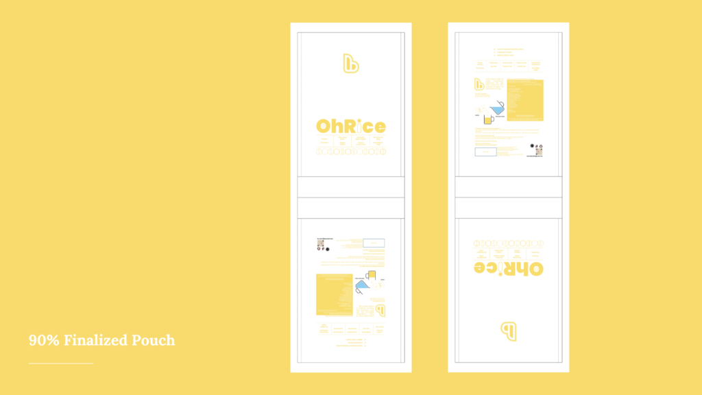
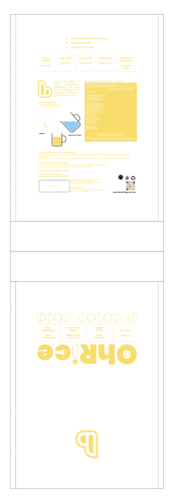
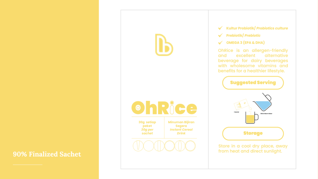
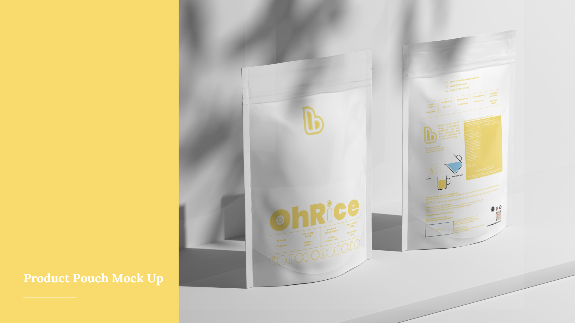
Brief: I was tasked to design a product packaging for product – OhRice, a rice milk beverage, an alternative beverage for milk, as special needs children needs to avoid dairy products.
Approach: I am inspired to create the packaging in a minimalistic way, to show that this product is clean and allergen free, with unique colour for product that helps public to understand instantly that it is an antioxidant product. The packaging is aimed to be more square than rectangular, in a more compact and interesting shape to catch others’ attention. Furthermore, I have also developed symbols and print to create a stronger visual identity for the product and brand. Besides that, I aim to use a matted surface to show a more toned-down, organic, natural feeling of this product.
Challenge & Solution: The biggest challenge of this project is to keep the design really simple and yet unique, eye-catching, and with strong visual identity. As we have to ensure only the most essential information is displayed, we have to minimise the use of colours and fonts. So I decided to keep the font to 1 font, and use 1 colour for each product in this series to represent each product. The repeated symbols are used sparingly under the title ‘OhRice’ and the information, to keep everything as clean and as simple possible, yet recognisable in a glance.
Client: Db (Dawn Bridge Sdn. Bhd.)
Follow me on IG: https://www.instagram.com/yeejin_kah
