Background story: Dawn Bridge is a company who aims to help special needs children and its community through various platforms and services, including creating awareness, provide allergen-free product for special needs children, due to their sensitive gut and special requirements in diet to help them in terms of mood and physical health.
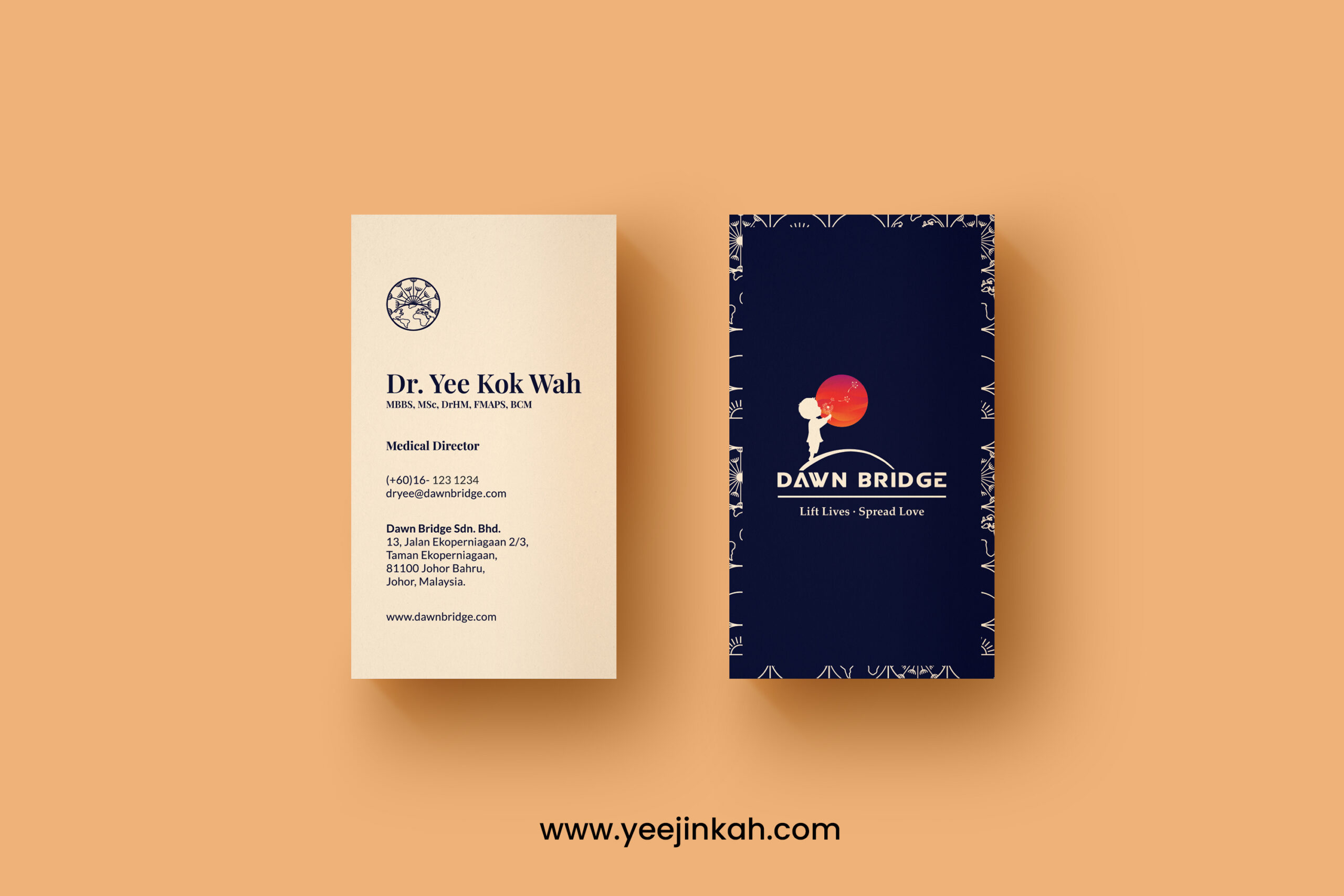
Brief: I was tasked to design a name card for the team in Dawn Bridge, to effectively communicate their contact info and expertise, as well as conveying the general vibe of the company.
Approach: I am inspired to create the name card using two different colours, both part of Corporate Identity to effectively create a unique visual effect that attracts the recipient. At the same time, I’ve selected a 400gsm uncoated paper, with a unique and organic hand-feel to generate an instant impression through touch. Repeated prints of the brand is used around the edge of the front main logo, while the secondary logo is used on the back together with the name and details.
Challenge & Solution: The biggest challenge of this project is to accurately produce the dark blue tone that we want to achieve, as the original colour of the paper was cream colour so we have to make several adjustments to achieve the closest that we aim for. We also had to make sure the lines of the repeated prints are thick enough to show clarity of the pattern but not too thick that it became blurry or too bold and overbearing. After several adjustments, we manage to arrive at the best final outcome that we hoped for.
Client : Dawn Bridge Sdn. bhd.


