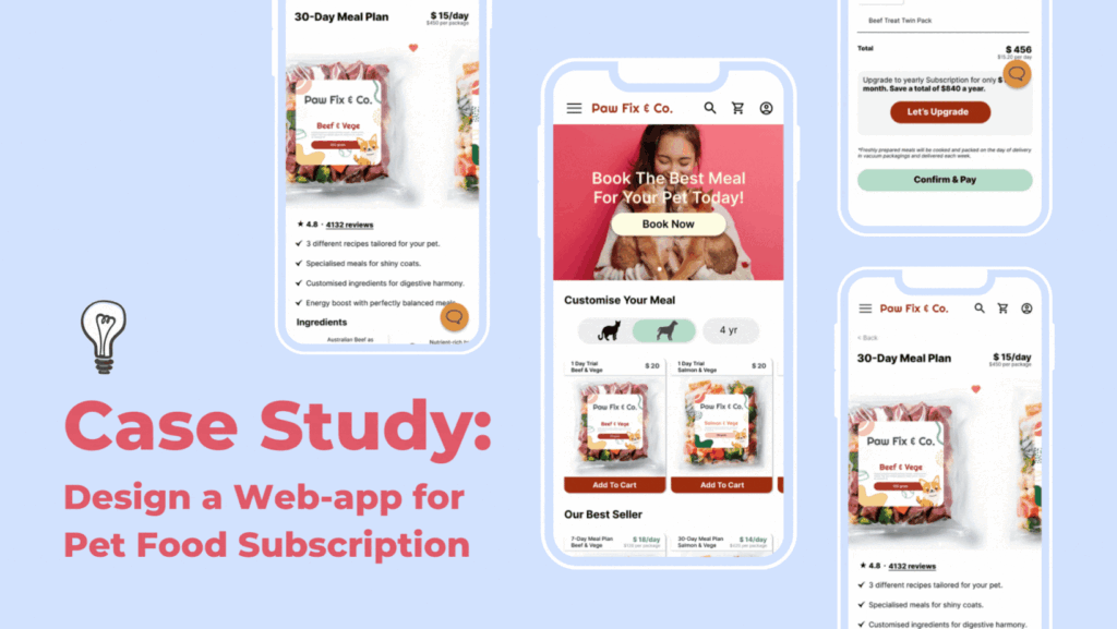
The product: This is a web-app designed to help busy working adults who can’t prepare well-balanced food for their pets (cat & puppy) due to busy daily schedules.
Project Duration: Approximately 3 weeks.
The problems:
- Busy working adults unable to feed their pets on time or with healthier choices, instead make do with kibbles that is not freshly made.
- Busy working adults who need help to provide a proper diet suitable for their pet due to their medical conditions.
The Goal: Our web-app will let users subscribe and make payment easily for their pets meal which will affect the users who don’t have time to prepare healthy meals for their pets by ensuring the meals are freshly made according to recipe by trusted pet nutritionist and delivered accordingly to their location on time. We will measure the effectiveness by how many subscriptions we receive each month.
My role: UX generalist: UX research, Interaction Design, Visual Design, Branding.
Responsibilities: User research, wireframe, low and high fidelity prototype.
Tool: FigJam, Figma.
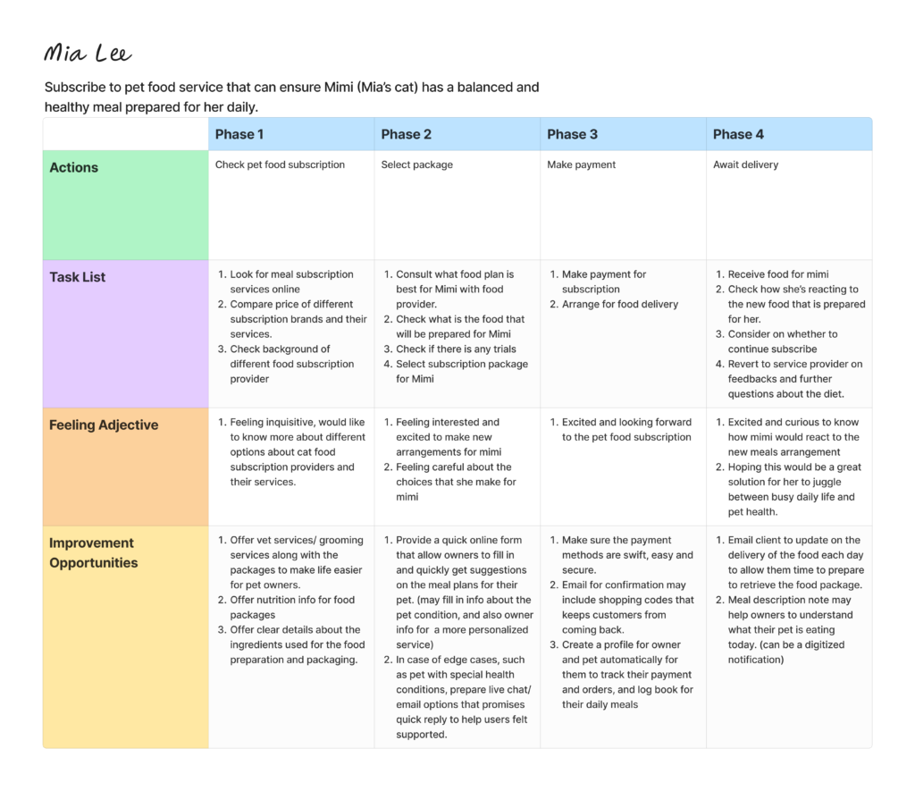
User Research
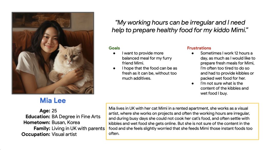
Persona

Problem statement: Mia is a Visual Artist who needs pet food subscription service because she can’t make fresh healthy food for her cat daily and regularly.

Digital Wireframe & Prototype
Design thought process:
- Homepage
- Menu section contains a hamburger menu that fly out when tapped, brand logo, search, account, cart icons for easy access.
- Hero section displays latest news, trial package and etc. with CTA for clients to take action.
- Design with simplicity and direct display of packages available for both cats and dogs, with their age selection to easily filter through the meals suitable for them.
- Help clients make decisions by adding the best sellers section on page.
- Display product by yearly/ monthly / weekly subscription package, to help recurring customers to find what they want immediately.
1.1 Homepage Review
- Overall elements are too small for a clear and easily accessible user experience. Increase the size of all elements, such as Menu bar, icons, size of thumbnails and texts.
2. Package Page
- Design a back button on the top left of the page
- State package name and prices clearly on the top left and right of the page.
- First session is to describe the ingredient used for the meal package
- Second section is a short and concise list of benefits of the meals for the pets
- Third section is drop down button for scheduling delivery date and time
- Forth section is for add ons
- Finally Add to Cart button at the bottom of page.
- Display a chat button throughout the website for clients to easily ask questions.
2.1 Package Page Review
- Increase the size of texts for clear view of content
- Avoid confusing the clients by listing the total package price below the price break down.
- Below the package name is a clear product picture session to show the real product and how clients can expect them to be like.
- Add a favourite button on the picture for clients to easily add to ‘favourites/wishlist’
- Below the image is a review section where clients can see the rating of the product or tap in to see reviews from actual users.
- For weekly subscriptions, its best to be able to customize the meal using different ingredient, so its better to have a section to allow clients to customize what type of food will be delivered.
- Next the scheduling section has changed from drop down to a calender view with a toggle button to allow clients to arrange a recurring delivery time slot for each week, if its a monthly or yearly subscription.
- Finally the size of the CTA button has to increase to stand out on the page.
3. Check out page
- Design Check out page with a main title on top left, and total pricing on the top right.
- Allow customers to upgrade their service after the summary fof the package.
- Clients may go to payment page directly if they do not wish to upgrade their package.
- The layout is similar for an upgrade service , with a note to show how much clients saved in the long run.
3.1 Review Check Out Page
- Display small thumbnails of product selected in exchange of long texts to help clients visualize and understand the summary easily in a glance.
- Show the quantity below the price to allow clients to do multiple bookings for not just 1 pet but 2 or more pets.
- Opportunity: I think we can also think about how multiple bookings of different customisation going to look like on the check out page.
4. Payment Page
- Starts with a back button on top
- Payment method is provide as a drop down, with space to write the credit card numbers, and a toggle button to save the card for easy future payment.
- Delivery address follows and with a toggle button for billing address incase it is the same as the delivery address.
- CTA button at the bottom of page
4.1 Payment page review
- Overall text of the order is increase and in bold.
- Add email address section for clients to receive their order confirmation and updates.
- CTA at the bottom increase in size and with contrasting color to show what clients should do
- All color combinations are tested to ensure the contrast is enough for clients who might have visual impairment.
6. Subscription order confirmation (Thank you)
- ‘Thank you for subscribing’ is written on top to show clients they have successfully placed the order.
- Order confirmation details are once again listed clearly below.
- CTA at the bottom allows clients to go back to homepage with ease.
6.1 Subscription order confirmation (Thank you) Review
- A big green ‘tick’ icon together with thank you message to show visually to clients that the payment and order is completed.
- Show the confirmation details like the check out page to allow clients to quickly scan through.
- Increase the size of Homepage CTA for better accessibility.
7. Empty cart page
- starts with back button on top left
- A empty cart page is designed to show how the cart look like without booking.
- a CTA continue shopping is created to allow clients go back to homepage easily to continue shopping.
7.1 Empty cart page Review
- Back button on top is removed, as the CTA is the same function.
8. Hamburger Menu (Fly-out menu)
- ‘My Account’ is shown on top, with other pages and functions nested below.
- ‘Homepage’ CTA is added at the bottom to close the menu.
8.1 Hamburger Menu (Fly-out menu) review
- ‘Homepage’ CTA is changed to back to close the menu, as the hamburger menu can be accessed from any page.
Opportunities:
- We can further design how ‘My Account’ page could look like to help clients access to their bookings and scheduling easily.
Key Takeaways:
Positive impact:
- I’m confident this app will be able to help busy adults in caring for their pets. As pets are family, guilt about leaving them alone and unable to provide a proper meal is common. This service allows owners to customize fresh, additive-free meals, fostering confidence and well-being for both owners and pets.
What I learned:
- I believe it’s crucial to consistently revisit and refine the design through ongoing app usability surveys in any project. This is essential to understand current user interactions, anticipate responses from new generations over time, and consider the diverse ways pet owners from various backgrounds will utilize the application.
- I think understanding how pet owners care for their pets is crucial to discern how the app can genuinely assist them. It’s essential to be mindful that there may be an underserved or unrepresented group of individuals who require the service but face barriers accessing the web app, such as due to their location or disabilities.
- During the user interface design process, it’s crucial to test the prototype on mobile phones to optimize text and image sizes for an enhanced user experience. Designing on desktop or laptop may lead to unintentional oversights, such as elements being too small, underscoring the need for thorough usability checks.

