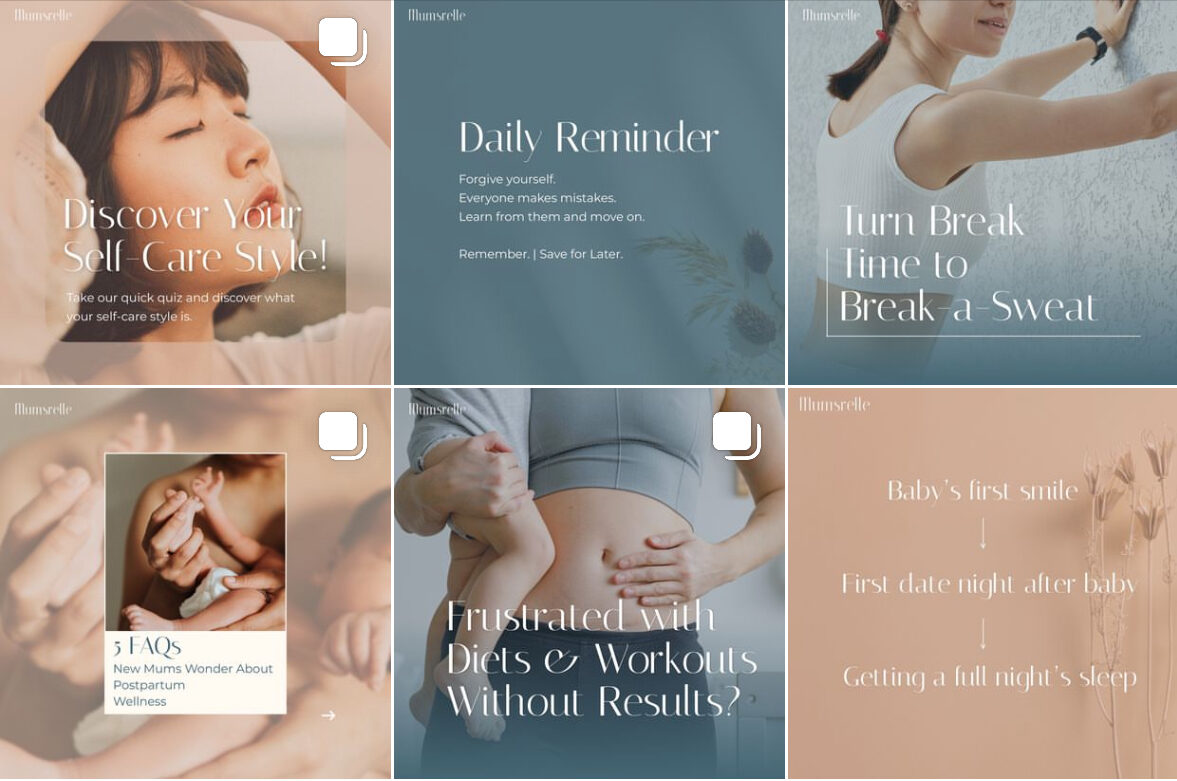
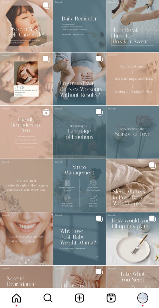
Approach: Commencing the concept development, my focus lay in comprehending the brand’s trajectory and its prospective client base. I aimed for distinctiveness amidst the commonplace hues prevalent in many slimming centers, notably the ubiquitous purple and red palette. My objective was to curate an aesthetically pleasing palette evoking tranquility and freshness using pastel blue and beige tones.
Challenge & Solution: The primary challenge entailed striking a delicate balance within the color palette. While aiming for soft pastels, avoiding an overreliance on nude or earthy tones was paramount to evade a generic outcome. It was crucial to harmonize the infusion of blue and earthy hues, ensuring a blend that exudes both warmth and coolness for a universally appealing aesthetic.

Follow me on IG: https://www.instagram.com/yeejin_kah
