Background story: Dawn Bridge is a company who aims to help special needs children and its community through various platforms and services, including creating awareness, provide allergen-free product for special needs children, due to their sensitive gut and special requirements in diet to help them in terms of mood and physical health.
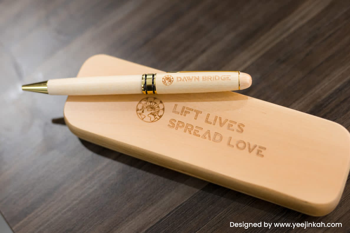
Brief: I was tasked to design a corporate T-shirt for team of Dawn Bridge for internal use as well as corporate gifts.
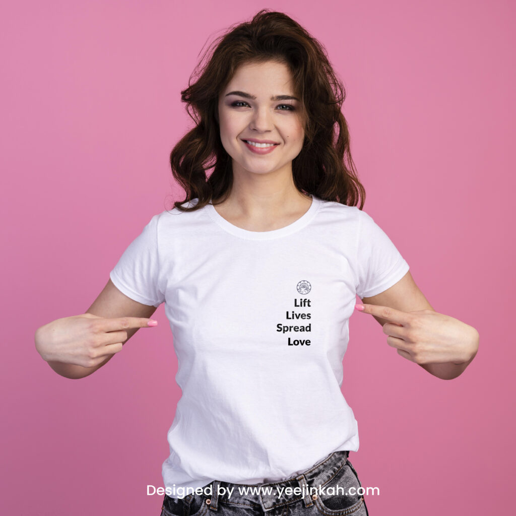
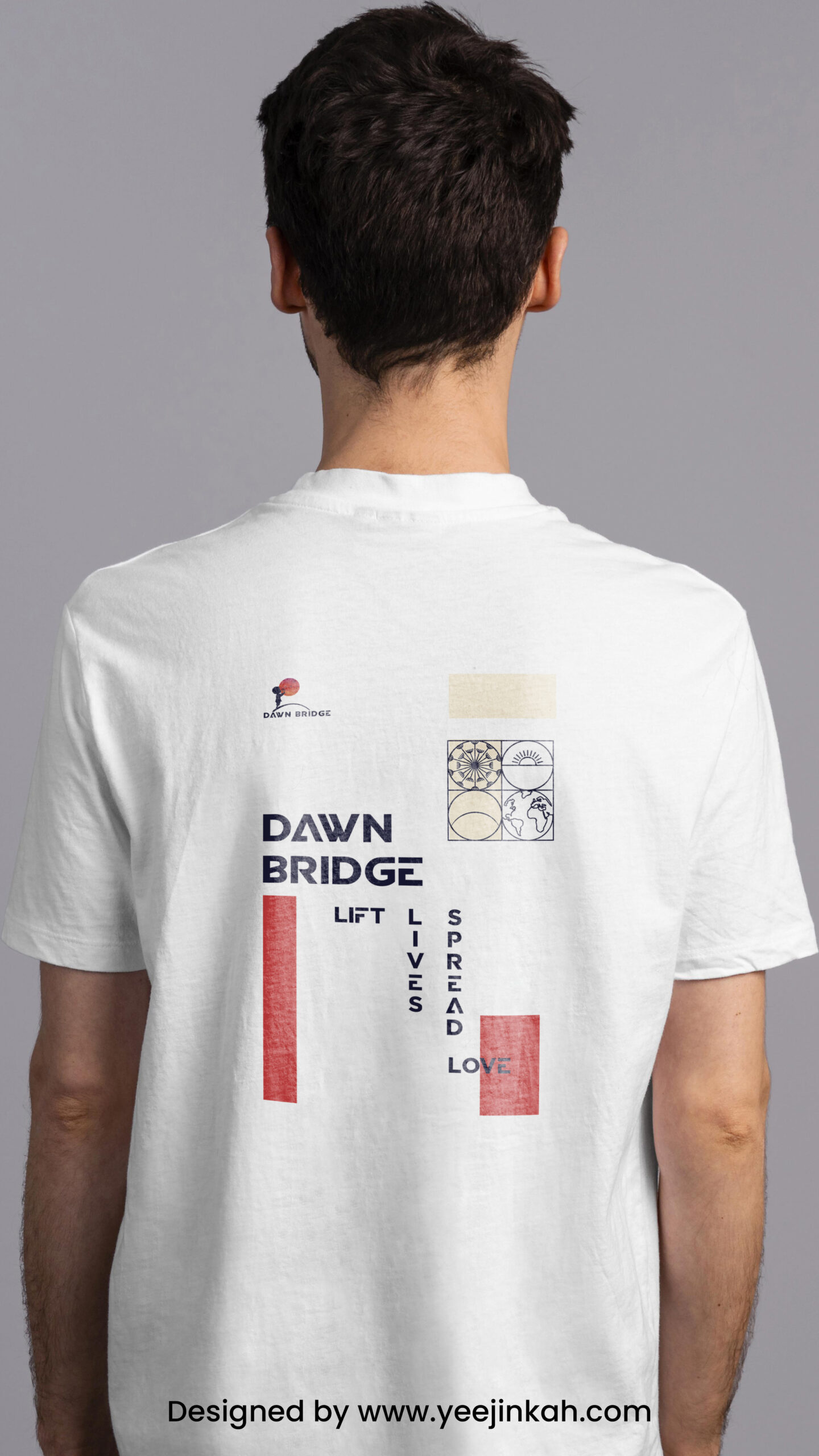
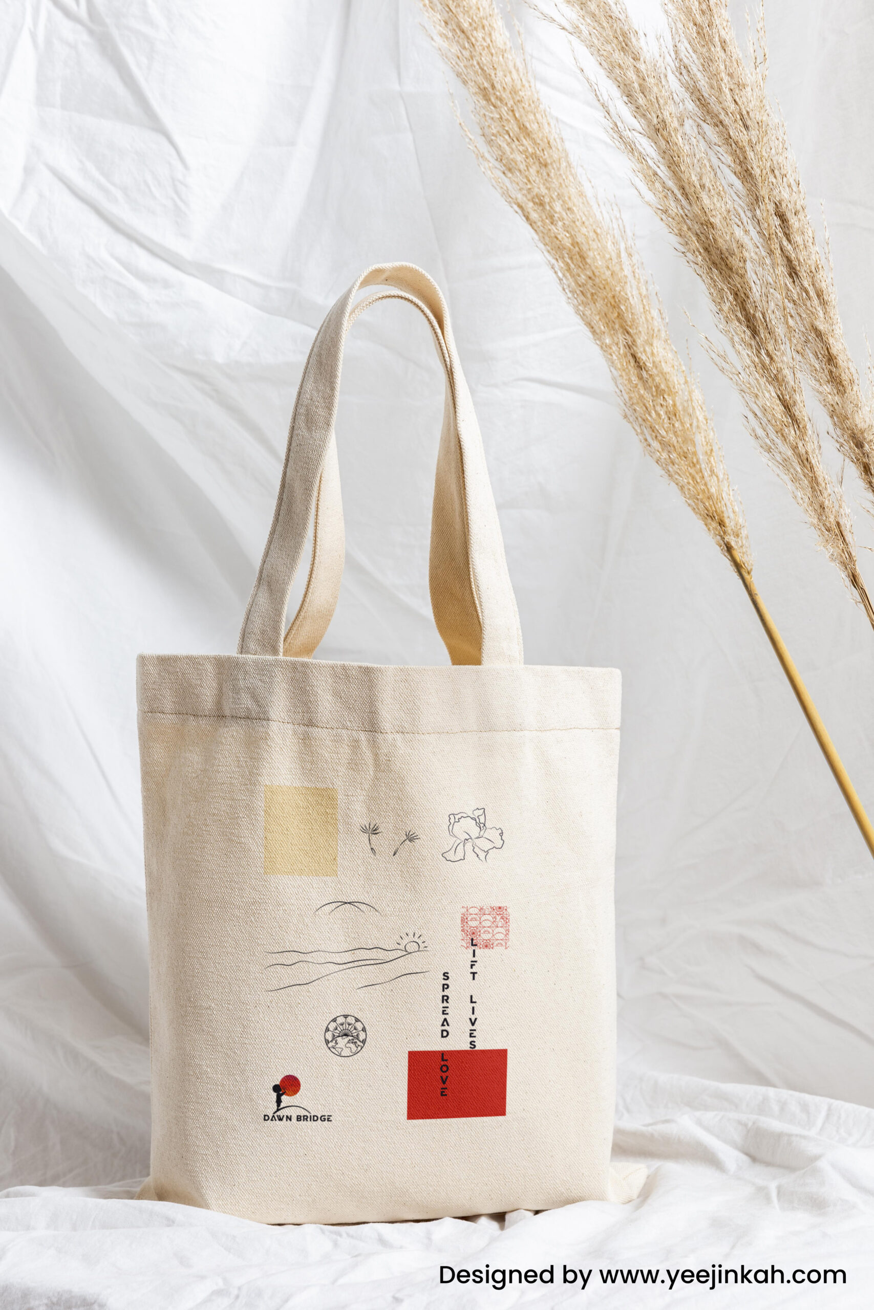
Approach: I am inspired to create the graphic layouts using pop of colours within the Corporate Identity colour scheme, while including main logo, secondary logo, slogan and symbols that represents the company. Even though this is a corporate T-shirt, I would like to keep the design of the T-shirt as modern and trendy as possible while keeping the identity of the company in check. This is to attract the attention of public and entice them to wear this T-shirt as an outfit. That way, not only they are happy wearing it, Dawn Bridge will be able to subtly promote awareness of the brand in public. Instead of having full graphic on the front, I placed the design at the back of the shirt while keeping the front of the T-shirt clean, with just the secondary logo and slogan.
Challenge & Solution: The biggest challenge of this project is to create a modern and trendy graphic layout using corporate logos. I tried to research for inspirations and also did a lot of variations, and eventually managed to arrive at the final layout that everyone is happy with. I try to create graphic layouts that is neatly arranged while using contrasting colours like red and almond colour to give the layout a lively touch.
Client : Dawn Bridge Sdn. bhd.
Follow me on IG: https://www.instagram.com/yeejin_kah
